Feedback & Finish
- Jun 6, 2024
- 2 min read
Updated: Jun 14, 2024
Based on what I had on my webpage, the feedback advised me to be conscious of what I will display with the word search puzzles.
The colour theme was my first choice, and the feedback was not a matter, so I kept it. So I went on with the effects for each element. I used the letter/diary concept and the paper notes should be nicer when being dropped shadow, which created the deeper visuals, so I added the effects then.


Besides, I also changed the colour of the titles (from black to dark green) based on JinSeo's feedback as he helped me recognise black was a bit off. Combining the effects for elements and texts made the webpage more accessible.
The profile picture on top was more impressive than being sent to back.


There were many sheets stacked on top of each other so dropping shadow makes the display more realistic and creates an effective visual experience.


When hovering, some main menu texts are underlined/highlighted so that users understand they definitely can click on those buttons.


I made progress with the zip bag. This element went crazy when I tried to create more variants and building the interaction was really time-consuming. I don't know how many times I had been frustrated during the process as this one sticker could mess up when I dealt with the other one. It was because I had no idea of the root principle of why the problem repeated so many times. However, being patient, focusing on each variant, checking it and going on with another one worked everything out.
I figured out that I shouldn't move the inner element more than once after it had been in the variant. If it was out of the component and once I needed to move it back to the component, it would shuffle to the other variants. Hence, during the preview, when I hovered over this one sticker, the text on the other sticker also jumped around even though I didn't put interactions for it.
Generally, the more variants I created, the more exploded I was.


Some notes during the process:


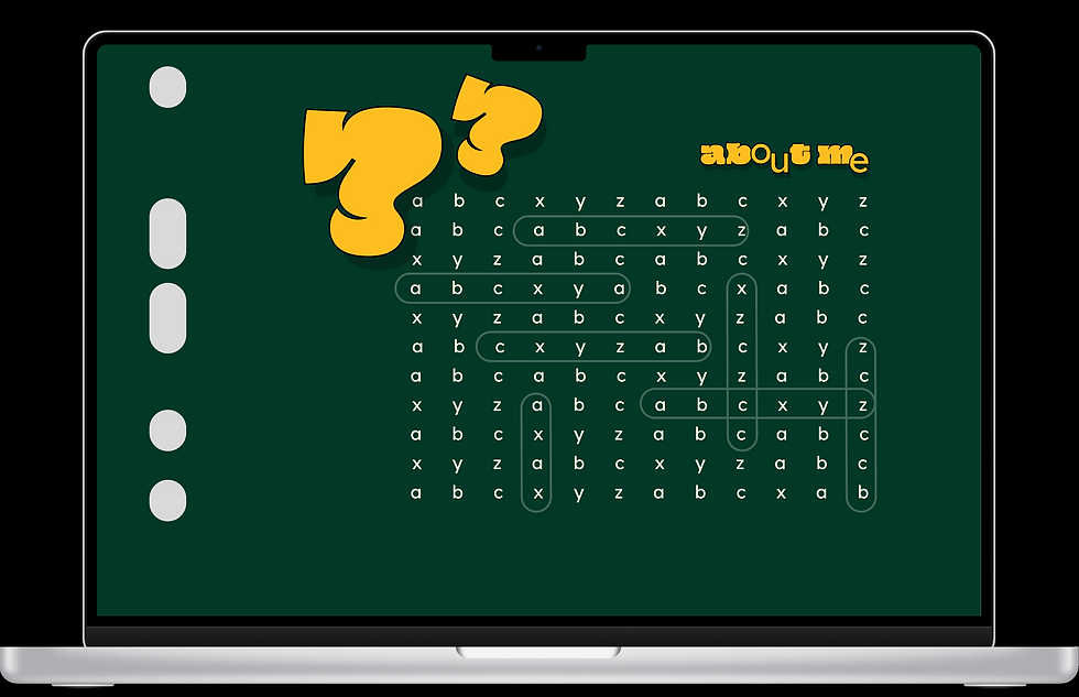
To describe myself, I both used paragraphs and keywords. For paragraphs, I tried to ensure they were not too long with the whole boring text but maintained some highlights (bold texts) to draw attention (the texts are not too bland). The question marks were used to express that this is a 'Q&A' section or something about the explanation that the users should learn a bit about me here. The word search puzzles were displayed to approach the users' understanding in an entirely different way.


For the phone version, I located the elements vertically. The images were displayed first and followed by the descriptions (below) so that the artworks were still big and clear enough and the vertical space should not be too empty.


Comments