Design and audio decisions
- Apr 26, 2024
- 2 min read
Updated: May 28, 2024
Week 6 Session 1
Audio decisions
I used Audacity to produce 9 pieces of sound effects for my 9 graphic icons.

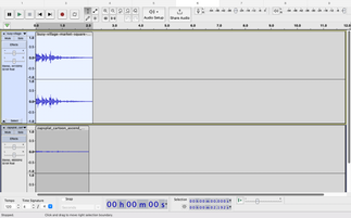


Every final sound was composed between two different sound effects.
The first sound would symbolise the character/ the event/ the location demonstrated in that one icon. For example, the first icon is a cup of drink (coffee) so I was looking for 'coffee slurping' keyword.
The second piece of sound would enhance the emotion of joy and liveliness of the icon, especially when the theme is Community and I'd like to express a feeling of authenticity, fun, and sense of belonging to create a connection with the audience when joining the community I create. They are almost cartoon sounds and bring the feeling of excitement as the facial expressions of each character change when swapping.
I added Fade out (some Fade in) and lowered the peak amplitude to ensure the sound can work well and not be jarring in a very short period of playing time.
Design decisions
01. Simplify the details
Some of my icons used to be complicated. For example, this icon had included a lot of elements (fruits) inside the basket before I figured out it had no unity with the remaining simple icons. I minimised the details on the basket and the kinds of fruit, leaving just a little symbolism. The colours were also minimised, leaving only a few lines to identify the shape of the fruit.


The below icon used to not work with the remaining icons due to its different inner details. It had lots of trees as I intended to create a symbolism of the environment but it ended up too complicated and lost the cohesity. I simplified it into a piece of land with a tree and used simple shapes like the other icons.

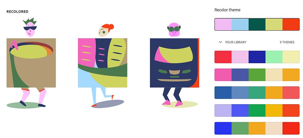
02. Consistency
At first, my sketchings were quite random and they just remained consistent in the jigsaw puzzle shapes. I gradually kept sketching and figured out how they could connect and built a more comprehensive suite.
I created human bodies based on the puzzle with a head, legs and a shade each. This idea also contributes to the main theme's meaning as community is connected not only by places and events but also through people primarily. Human emotions, expressions, and appearances also play huge roles.
Moreover, the curves were created to maintain the unity between the 9 icons. The initial details were refined and developed into shapes that had curved lines.

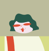
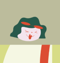
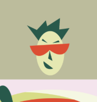
03. Characters
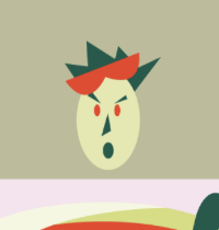
As mentioned above, each figure has its specific expression and all of them varies different generations and types of people in this community. For that reason, I made the image swapping by bringing in new expressions of the characters when the audience mouse over and there will be an accompanying sound.
04. Puzzles
I took advantage of the jigsaw puzzle shapes to create the related elements.
For example: the car's mirrors on both sides of the puzzle, the eraser of the pencil, the circular shapes of the music notes, or the cup handle.


Comments