Flat design with Colour design
- s4062292
- Apr 19, 2024
- 3 min read
Updated: May 28, 2024
Week 5 - Session 1
Theme: Community
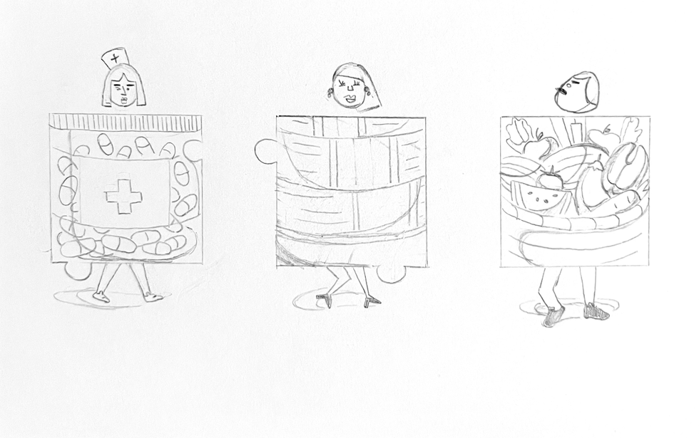
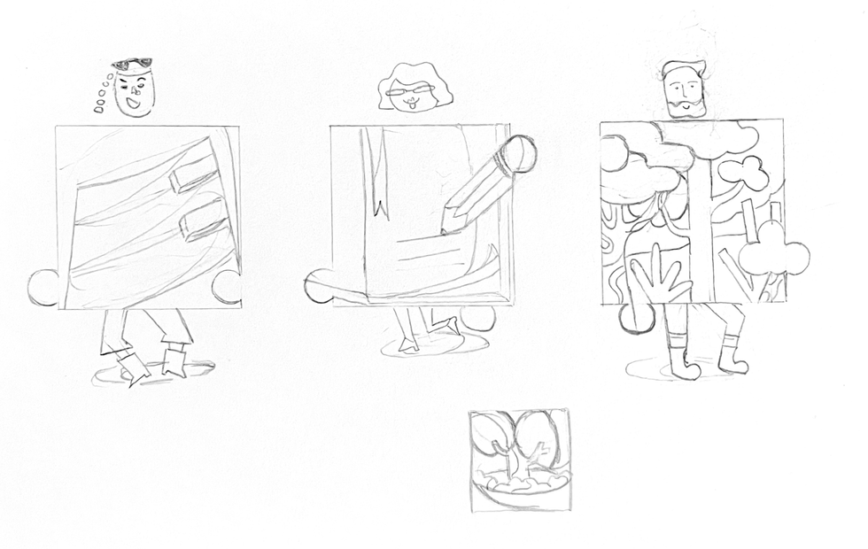
Final sketching on paper
Translating the thumbnail sketches into the Flat Design style
in Illustrator (without colours)
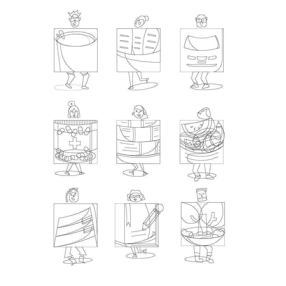
Creating colour design
(Create a colour design using only one hue. Then, go on bringing in another hue each time)
01.
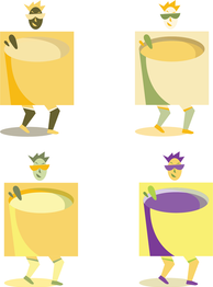
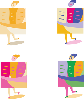
For the first icon, I chose yellow as the first hue because yellow produces a vibrant and warming effect. My chosen theme is Community and it aims to introduce the ongoing activities in the area while yellow effectively stimulates mental activity, and generates muscle energy.
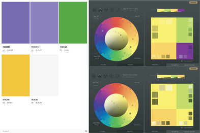
Analogous: I tried the second time with the colours yellow and green using Paletton.com to generate these two adjacent colours in the colour wheel. Using yellow as a dominant and green as a supporter, I put yellow into bigger elements and observed if it worked out.
The third attempt was with three adjacent colours also generated on Paletton.com. I wanted to keep the icon in yellow based on its association (sunlight, high spirit) so bigger elements are covered in yellow and two others support the highlights.
Finally, I tried Split Complementary with the colour purple which is the opposite of the three other adjacent colours I had used in the previous attempts. The palette I found on Adobe Color was also a potential choice for the icon. It ended up being something that didn't meet my expectations when trying to use purple to contrast this icon. Even purple would be highlighted but the whole icon was not attractive.
The second and third ones seemed to be more harmonious with enough variety of hues. However, this yellow wasn't bright enough and having too much yellow wasn't a clever choice.
02.
I keep starting the second icon with a yellow varying saturations and values. The second colour I put in was pink and I continued with the palettes generated on Adobe Color. The use of blue in this icon effectively worked more than I could imagine. It had enough contrast and drew attention in the first look. The colour green would have worked better if I'd placed it in the more suitable elements. Red would be the 5th colour if I kept going on.
I considered using the palette of the third attempt (yellow, pink, amparo blue) in the final work.
03.
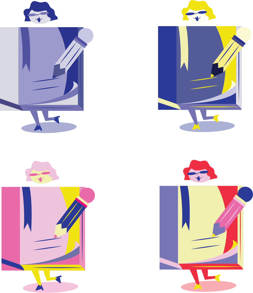
Starting with blue which is linked to intellect and peace, I had the first attempt with this icon about the education field. Going on with putting yellow on the second try, I recognised that blue going together with a warm colour like yellow can create a high-impact and vibrant design. Another palette from Adobe Color was used.
The third colour design was created based on three colours I had used for the previous icon but this time with the more saturated ones. They were more vibrant and brought youthful dynamism. The last one also caught my consider when red as the supporter highlighted the icon so well. However, I think eliminating the amount of red would be better.
04.
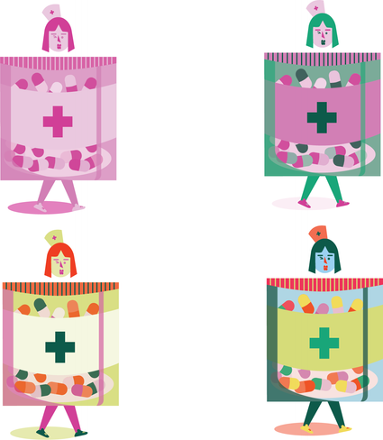
I created the colour design for this third icon using only pink which is linked to warmth and love. Next, I used its complementary, green, to create the second colour design. Green symbolises nature and growth and I think they worked well together. However, they wouldn't be suitable if I applied only two of them for the whole suite. There was no point in catching attention.
I considered the third colour design as one of my potential choices when the palette (with three hues) had enough desired saturation and value. It helped enhance every detail in the icon and make the subject lively. When it came to the last colour design, I put in blue which I thought could balance the remaining hues but it didn't fit this design indeed.













Comments